How to Choose the Right Background for a Quote
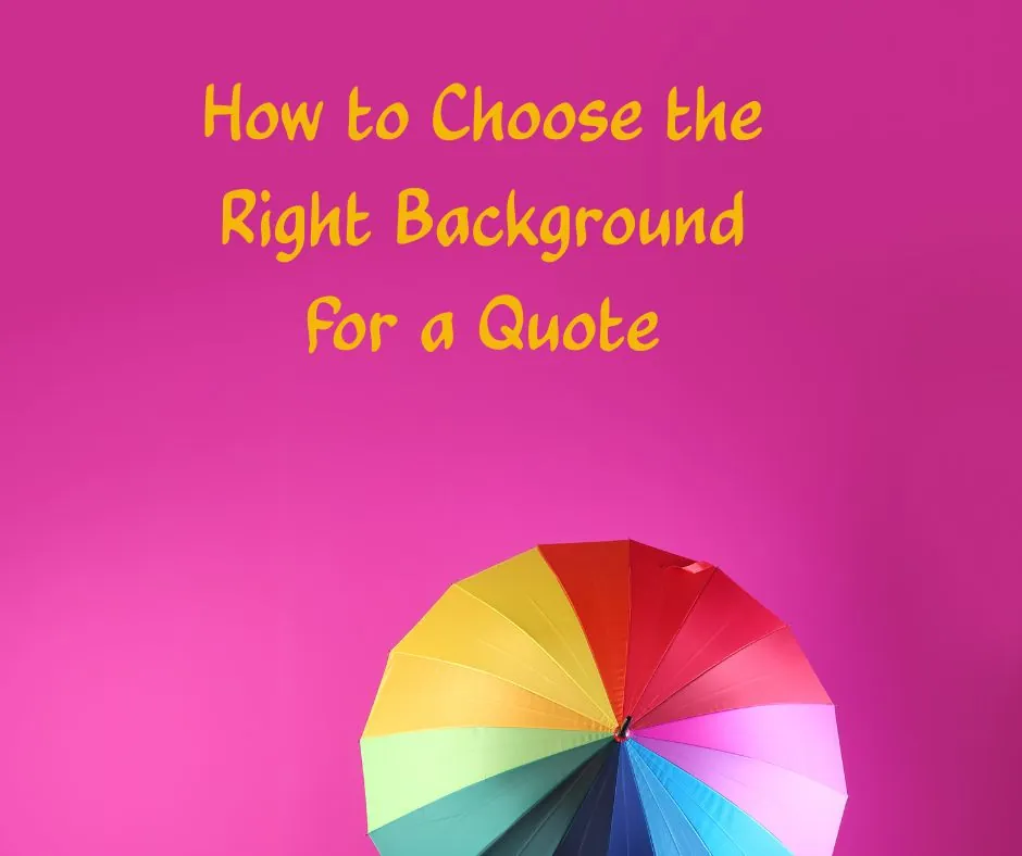
Imagine a line about grief set over a photograph of a beach party. The lettering is fine, the words are sincere, and yet something is off, the way a sad song sounds strange at a wedding. The background has quietly contradicted the sentence.
That is the first thing to understand about how to choose the right background for a quote. A background is not decoration. It is the weather the words are standing in.
Match the Weather of the Words
Before you look at any images, ask what the quote feels like. Is it calm, wry, urgent, tender, defiant? Then look for a background that feels the same way.
A quiet line about patience will sit happily on a soft, muted colour. A joke wants something lighter and brighter. A line about starting over might suit open space, an empty sky or a pale gradient. If you cannot describe the mood in a word, the background will not be able to either.
The Quiet Options
The most reliable backgrounds are also the simplest. A solid colour is almost impossible to get wrong, and it keeps attention where it belongs. A soft gradient adds a little depth without competing with the text. A gentle paper or fabric texture brings warmth, as though the words had been printed on something you could hold.
Many of the most memorable quote images use no photograph at all. There is nothing wrong with plain.
Using Photographs Carefully
A photograph can add feeling, but it demands care. Choose images with quiet, empty areas where the text can sit, such as a wide sky, a blurred field, or a wall. A photograph full of detail and edges will fight the letters for attention.
If the image is busy, soften it. Blur it slightly, or lay a translucent dark or light layer over it so the lettering has a calm surface to rest on. Also avoid placing text across a person's face or across the point of greatest interest in the photograph. The words should never look like they are in the way.
Check that you may use the image
A photograph you found online is not automatically free to use. Use images you have made yourself, images licensed for the way you intend to use them, or images from a source that clearly states its terms. Many freely shared images are released under Creative Commons licences, and all six of the main Creative Commons licences require that you credit the creator, following the way the creator asks for it. The Creative Commons attribution guidance explains what that means, and how to attribute quotes correctly covers crediting in general.
Contrast Comes First
No background is right if the text cannot be read against it. Aim for strong contrast between the lettering and whatever sits behind it. The common accessibility benchmark, WCAG at level AA, asks for at least 4.5 to 1 for normal text and 3 to 1 for large text, and the WebAIM Contrast Checker lets you test any two colours quickly.
With a photograph, remember that contrast changes across the image: a line may be clear on the left and lost on the right. Check the whole width, not only the first word.
Colours Carry Different Meanings in Different Places
It is tempting to assign fixed meanings to colours, red for passion, blue for calm, white for peace. But associations vary by culture and context. In some traditions white is worn to mourn, while in others it belongs to weddings. If your readers come from many backgrounds, as most online audiences do, lean on the mood of the image as a whole rather than on the symbolism of a single colour.
Bringing It Together
Start with the feeling, choose the simplest background that carries it, and test the contrast. Then lay the text over it and step back. If the image looks slightly plain, that is often a good sign. For the layout itself, see How to Choose the Right Background for a Quote, and for the letterforms, how to choose fonts for quote images.
A good background is the kind nobody mentions. They remember the sentence, and only later realise how gently it was held.